Is Your Brand Ready for Digital? A Design Accessibility Checklist

Process

Micah Hair | Nov 27, 2024


Brand consistency is key to engaging your audience and driving revenue. Consistent brand use can increase revenue by 10-20%. Yet, many organizations invest heavily in brand strategy and visual guidelines without adequately preparing for digital spaces.

Illustration of web and mobile design elements, including a large 'Aa' symbol representing typography, a color palette, and icons for layout and image placement. The design elements are shown across different device screens, emphasizing responsive design. Some elements have checkmarks indicating correct use, while others have crosses or exclamation marks signaling errors. The background is dark with bright, colorful asterisks scattered around.
The Digital Accessibility Challenge
  • 95.9% of home pages had detected Web Content Accessibility Guidelines (WCAG2) failures in a 2024 review (source)
  • 81.0% of sites had low contrast text
  • Thousands face ADA lawsuits annually, with settlements ranging from thousands to millions (source)
  • 20% (or more) of people may struggle to access your brand information or services

We know how much time, energy, and money you invest into your brand. We get how important it is to go with the momentum you’ve created, and still optimize your brand for digital spaces.

So, how can you ensure your brand is ready for digital spaces?


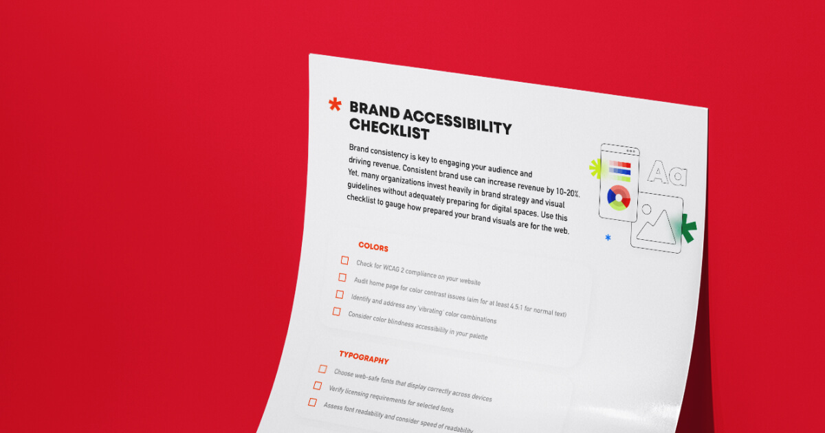
1. Color

  • Check for WCAG 2 compliance on your website
  • Audit home page for color contrast issues (aim for at least 4.5:1 for normal text)
  • Identify and address any 'vibrating' color combinations
  • Consider color blindness accessibility in your palette

The P3 Approach to Color

For New Sites:

  • We conduct color contrast analysis and color blindness studies to optimize the palette used on your site
  • We consider accessibility from the start, either while beginning with your established palette or creating one for you
For Existing Sites:

  • We audit your existing colors and can make adjustments that minimally affect the overall brand presence. This can mean:
    • Subtle adjustments of the HSB (hue, saturation, brightness) of a color in the palette that isn’t providing enough contrast with text (often these changes aren’t even noticeable)
    • Offer a second color option from the existing palette that meets contrast guidelines for legibility and accessibility

2. Typography

  • Choose web-safe fonts that display correctly across devices
  • Verify licensing requirements for selected fonts
  • Assess font readability and consider speed of readability

The P3 Approach to Typography

For New Sites:

  • Ensure current brand fonts are web-safe and you control their hosting or;
  • Choose fonts that are web-safe, align with your brand, and are easy to read
  • Consider load performance; avoid bloating the site with too many fonts or styles that ultimately will hurt performance instead of enhance the brand
For Existing Sites:

  • Once you’ve lived in your site for a bit, you start to get a feel for how the various header and body styles are working for you, what you use, what you don’t, or even what just isn’t growing well with your brand
  • In these cases we are able to universally adjust font styles to better meet the needs of site, now that you have added your content, removed other content and see how all the styles are meshing together

3. Graphic Assets & Photography

  • Ensure graphics are scalable for both mobile and desktop views
  • Optimize image file sizes for faster loading without sacrificing quality
  • Use vector formats for logos and graphics to maintain clarity at any size
  • Avoid embedding important text in rasterized images

The P3 Approach to Graphic Assets & Photography

For New Sites:

  • We collect all of your brand visual assets early in the process and often you’ll hear us request vector versions of graphics (.ai, .eps, or .svg files)
    • These allow us to make things as large or as small as needed without losing visual clarity (no pixels to be seen!) and they don’t compromise load time
  • We’ll also make sure we give you the guidelines (and templates or tools as needed) to help you curate your content library with file sizing and aspect ratios in mind
  • While exploring styles and layout, we make sure to give you flexibility without compromising accessibility with the wrong kind of design techniques
For Existing Sites:

  • We conduct Site Health Checks that can audit your site across several different areas and optimize for performance, security, and accessibility. 
  • For example, unnecessarily large image files or excessive css may be impacting load times and affecting your user experience.

We hope you’re feeling super confident about your brand after going through this simple checklist. But if you’re not, don’t stress! We’d love to talk about how to optimize your visual branding on your website, both for your peace of mind and for the people you serve.

Download our accessible (AKA: free!) Brand Accessibility Checklist below.

Micah Hair, Associate Creative Director