Process
| Aug 19, 2024

Remember when browsing the internet meant sitting down at your desktop computer and opening one of a handful of browsers? Those days are long gone. Today, you can access websites from just about anything—your phone, tablet, smart TV, and even your fridge (yes, really). With so many different devices and browsers in play, ensuring that your website works flawlessly across all of them is more important than ever. That’s where cross-device and cross-browser testing comes in.
Very simply, cross-device testing is the process of checking out how your website performs across different devices, including smartphones, tablets, and desktops. Different devices have unique screen sizes, resolutions, and processing capabilities, which can affect how your site is displayed and interacted with.
With new smartphones being released every year, it’s important for us to keep up with slight variations in their specifications. At Propaganda3, we account for these changes on a rotating basis to ensure that your website provides a consistent and reliable experience for as many users as possible, whether they’re on the latest model or an older device.
Cross-browser testing, on the other hand, focuses on ensuring that your website functions correctly across different web browsers, such as Chrome, Safari, Firefox, and Edge. Each of these browsers renders web pages differently, which can lead to inconsistencies in how your content is displayed.
It’s also worth noting that these browsers are updated frequently—sometimes multiple times a month. For example, Chrome tends to release updates every few weeks, while Firefox and Edge follow similar schedules. At Propaganda3, we make it a priority to stay on top of these updates, incorporating them into our development and testing processes to ensure your website remains compatible and performs optimally across all platforms.
By conducting thorough cross-device and cross-browser testing, we can identify and resolve potential issues that might otherwise go unnoticed until they’re already affecting users. This testing is essential for providing a smooth and consistent user experience, which is key to retaining visitors and encouraging engagement.
Imagine you run an e-commerce site specializing in apparel. It’s the holiday season, and you’re launching a new winter line. Traffic is surging as customers flock to your site to purchase the latest styles. Everything seems to be going smoothly on desktop browsers, but some customers using certain mobile browsers find that the checkout button doesn’t work. Frustrated, they abandon their carts and head elsewhere, leading to significant revenue loss for your business during one of the most critical sales periods of the year.
These issues can result in some pretty bad, but very real business scenarios. Darden Restaurants (parent company of Longhorn Steakhouse, Olive Garden, Yard House and more) had a tiny styling issue with some MAJOR repercussions that very likely cost them millions of dollars. In 2021, the mobile versions of its restaurants’ websites all suffered from a viewport height issue where their checkout buttons appeared just slightly off-screen for tablet users who were left hungrily scrolling, and ultimately unable to complete their orders.
Now, let’s say you operate a B2B manufacturing business. Your website features a "Get a Quote" button, crucial for converting visitors into leads. It works perfectly on Microsoft Edge, a browser favored by many enterprise users, but when someone tries to use it on the latest version of Chrome, a formatting issue has rendered the button unclickable. Potential customers are left hanging, and you miss out on valuable business opportunities because a key feature isn’t functioning across all browsers.
In 2011, Tesco faced issues where their website didn’t function properly on Internet Explorer, one of the most widely used browsers at the time. This malfunction specifically impacted the checkout process, leading to customer frustration and potential loss of sales during a crucial time.
While these scenarios keep our QA developers up at night, they also highlight the importance of comprehensive cross-browser and cross-device testing. By thoroughly testing a website across a variety of environments, you can catch and fix these issues before they impact your user experience and your bottom line.
Different industries have different needs when it comes to cross-device and cross-browser testing. B2B websites often see higher usage on desktop computers, as their clients and prospects typically access them from their work computers. In contrast, B2C websites may see a majority of traffic coming from mobile devices, as consumers mostly browse from their smartphones or tablets.
Tailoring the testing process to these specific needs is crucial. For a B2B client, it might be more important to ensure compatibility and performance across various desktop browsers. For a B2C client, the focus might shift to mobile device testing. By understanding and addressing these different needs, businesses can ensure that their websites meet the expectations of their target audiences.
We can take this a step further by using analytics to get a snapshot of how your site is being trafficked. This data-driven approach allows us to prioritize testing on the devices and browsers your users are actually using, ensuring that your website delivers a seamless experience where it matters most.
Sometimes, there’s nothing better than good old fashioned hands-on testing. We keep a variety of popular devices at the ready, including different iPads, iPhones, and Android devices. A member of our web development team keeps these devices at his desk, where they are always available for testing. We approach each site as if we were real visitors, browsing and interacting with it the way your users would. As we go, we note any inconsistencies or issues, ensuring that nothing slips through the cracks.
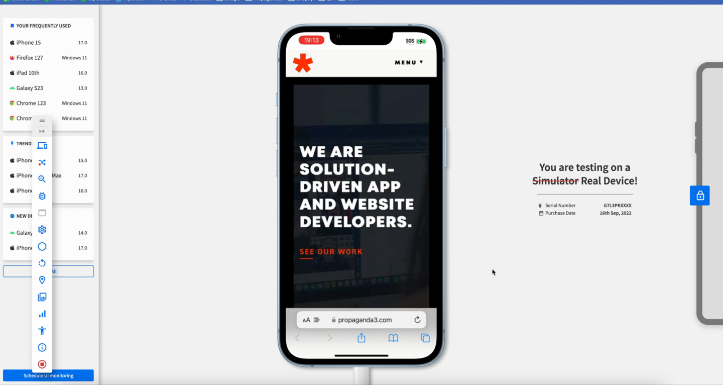
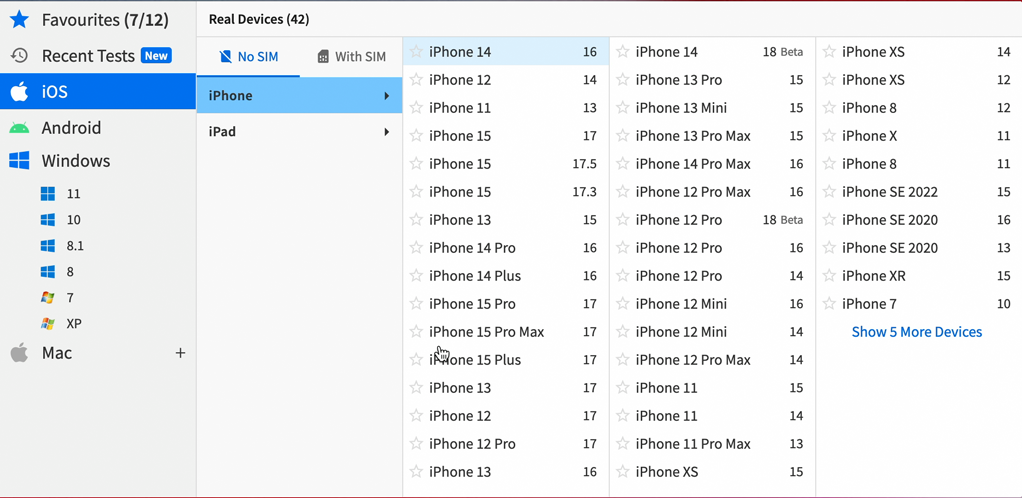
Another invaluable tool that we keep in our belt is BrowserStack. This allows us to test web environments on a multitude of different devices remotely. BrowserStack retains a vast inventory of nearly every device and model you can imagine. We can access those devices remotely within the tool’s interface to test real environments on real devices and ensure the best compatibility across them.


Inconsistent testing can lead to a range of negative outcomes. Users who encounter issues on their preferred devices or browsers are likely to become frustrated and leave the site, leading to higher bounce rates and lost opportunities. Over time, these issues can also damage a brand’s reputation, making users less likely to return or recommend the site to others.
Even more concerning, if your company never conducts this kind of testing, you might not even realize that an issue on a specific browser or device has been affecting your users all along. This means you could be missing out on customers who have consistently faced problems accessing your site and, as a result, have quietly taken their business elsewhere. As famously stated in the classic western “Cool Hand Luke”,

Ensuring consistent performance across all platforms is essential for maintaining user trust and engagement. Businesses that prioritize comprehensive testing are better positioned to deliver a high-quality experience that keeps users coming back.
The digital world is evolving pretty fast these days, with new devices, browsers, and technologies emerging every day. To stay ahead (or even just afloat), businesses need to adopt testing methods that keep their online presence looking good and functioning correctly across the board.
That’s exactly why cross-device and cross-browser testing is a critical component of our website development and QA process. We want to ensure that your users have a consistent and enjoyable experience, regardless of how they access your site.
If you’re looking to ensure your website delivers a seamless experience to all users, we’re here to help. Just give us a shout!